<style>
.container > div {
<body>
<div class="container">
</body>
.container > div {
background: #eee;
padding: 1em;
}
.container > div:nth-child(odd) {padding: 1em;
}
background: #ddd;
}
.container {
}
display: grid;
grid-template-columns: repeat(2, 1fr 2fr);
grid-auto-rows: minmax(120px, auto);
grid-gap: 1em;
}
</style>grid-template-columns: repeat(2, 1fr 2fr);
grid-auto-rows: minmax(120px, auto);
grid-gap: 1em;
}
<body>
<div class="container">
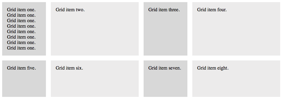
<div>Grid item one. Grid item one. Grid item one. Grid item one. Grid item one. Grid item one. Grid item one. Grid item one.</div>
<div>Grid item two.</div>
<div>Grid item three.</div>
<div>Grid item four.</div>
<div>Grid item five.</div>
<div>Grid item six.</div>
<div>Grid item seven.</div>
<div>Grid item eight.</div>
</div><div>Grid item two.</div>
<div>Grid item three.</div>
<div>Grid item four.</div>
<div>Grid item five.</div>
<div>Grid item six.</div>
<div>Grid item seven.</div>
<div>Grid item eight.</div>
</body>
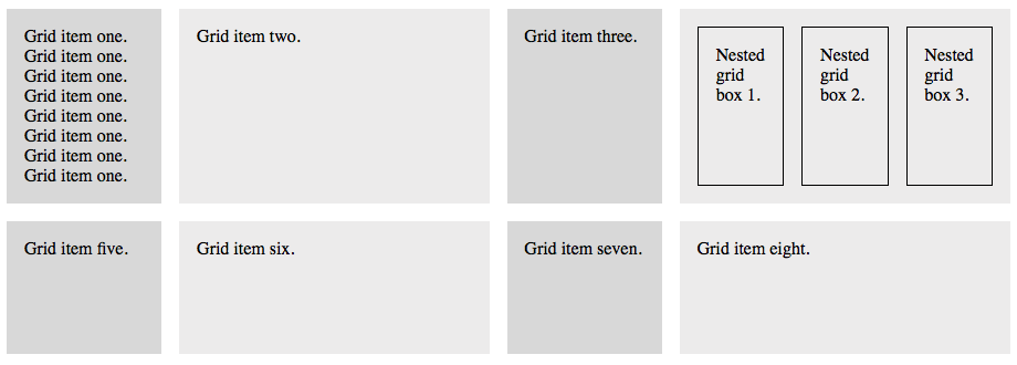
Nested Grids
Getting Started
Starting CSS
Let's begin by adding the CSS we utilized in the last lesson. We're shading the grid items in alternating shades of gray and creating a grid container that is repeating the pattern 1fr 2fr twice on each row. Use the CSS code to the left to take care of that.Starting HTML
Next, we will utilize eight boxes (grid items) for our layout. Use the HTML code to the left.Below is what you get in a browser.