<style>
.container > div {
<body>
<div class="container">
</body>
.container > div {
background: #eee;
padding: 1em;
}
.container > div:nth-child(odd) {padding: 1em;
}
background: #ddd;
}
.container {
}
display: grid;
grid-template-columns: 1fr 2fr 1fr;
grid-auto-rows: minmax(120px, auto);
grid-gap: 1em;
}
</style>grid-template-columns: 1fr 2fr 1fr;
grid-auto-rows: minmax(120px, auto);
grid-gap: 1em;
}
<body>
<div class="container">
<div>Grid item one.</div>
<div>Grid item two.</div>
<div>Grid item three.</div>
<div>Grid item four.</div>
<div>Grid item five.</div>
<div>Grid item six.</div>
<div>Grid item seven.</div>
<div>Grid item eight.</div>
</div><div>Grid item two.</div>
<div>Grid item three.</div>
<div>Grid item four.</div>
<div>Grid item five.</div>
<div>Grid item six.</div>
<div>Grid item seven.</div>
<div>Grid item eight.</div>
</body>
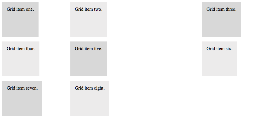
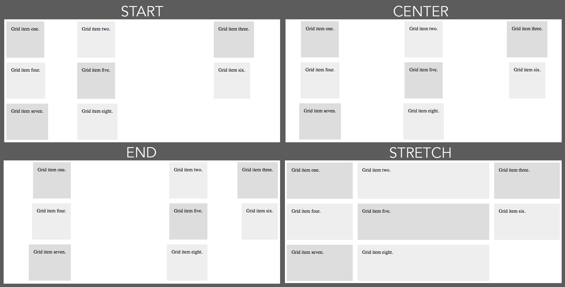
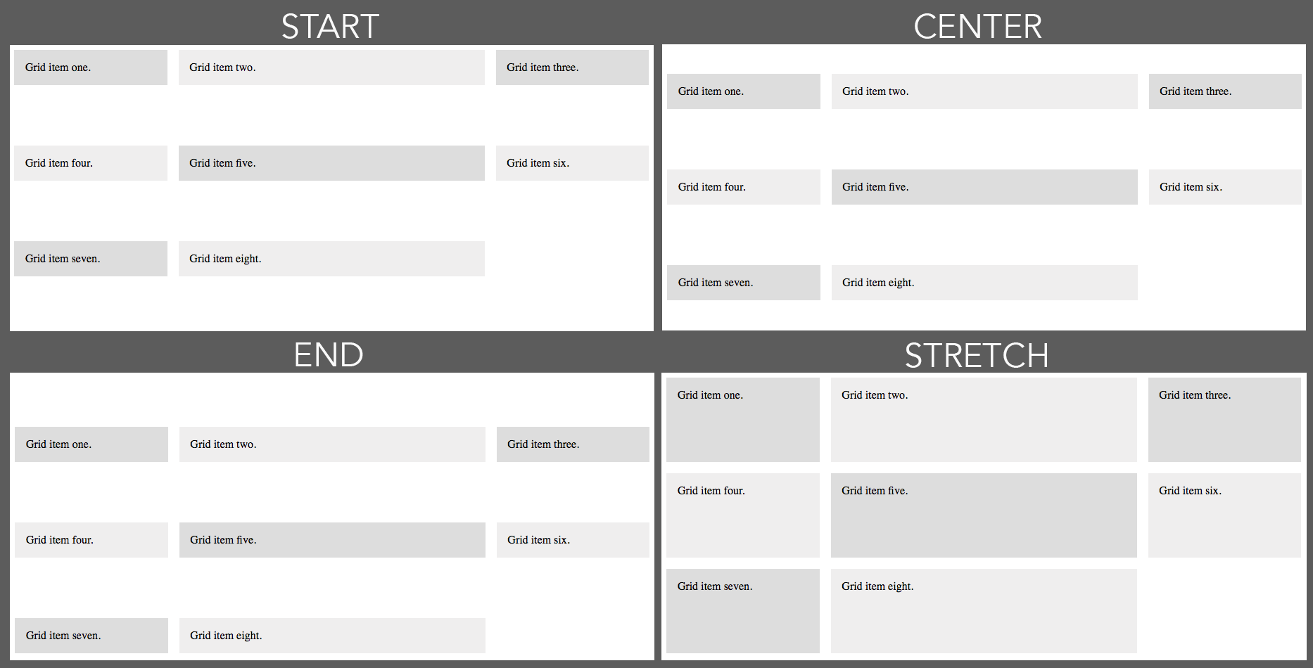
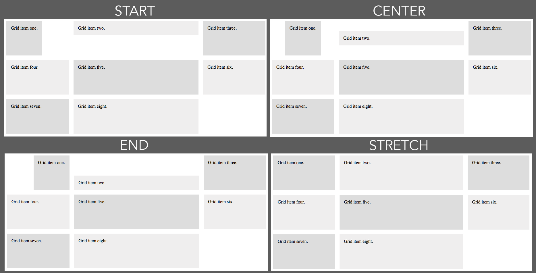
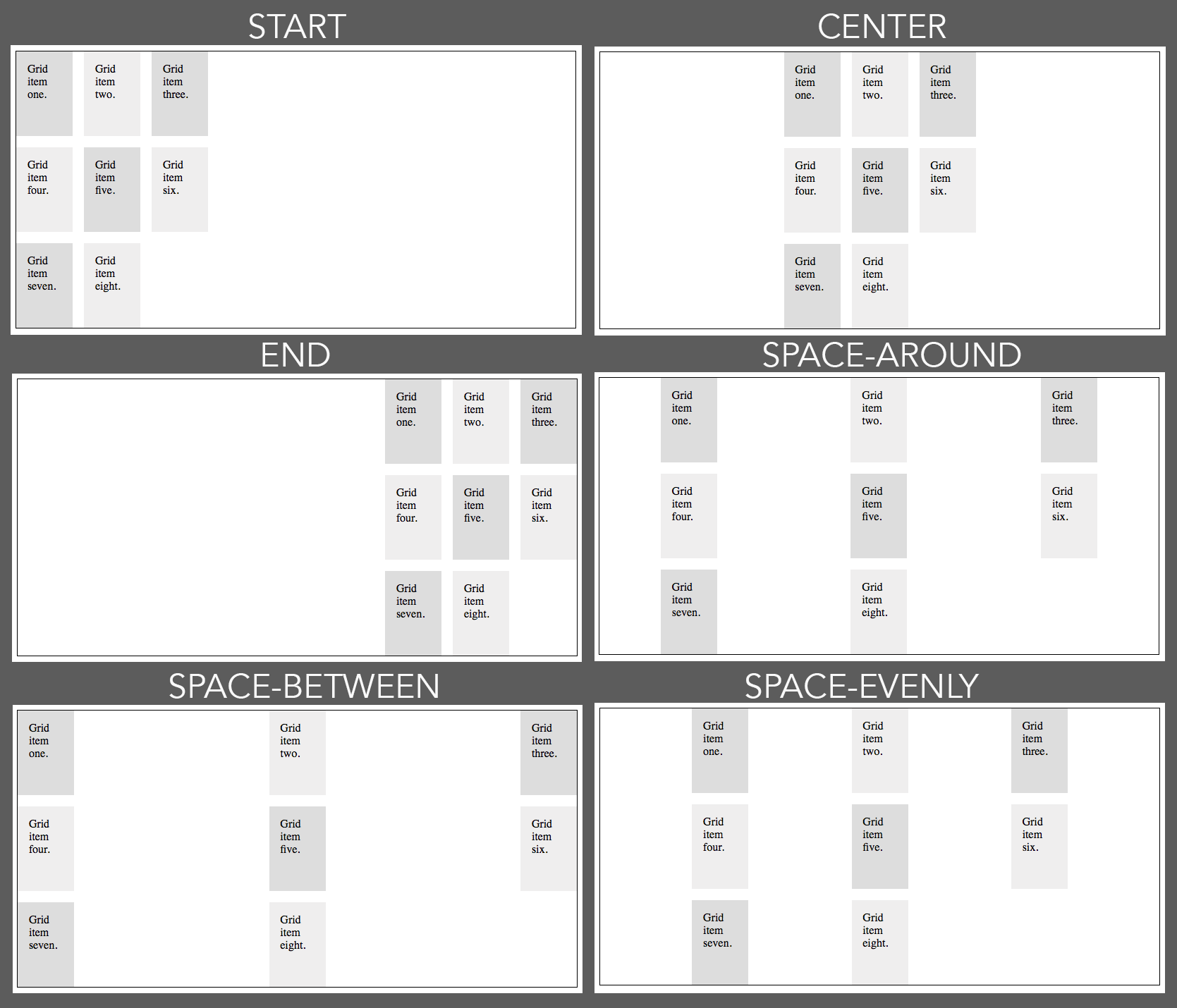
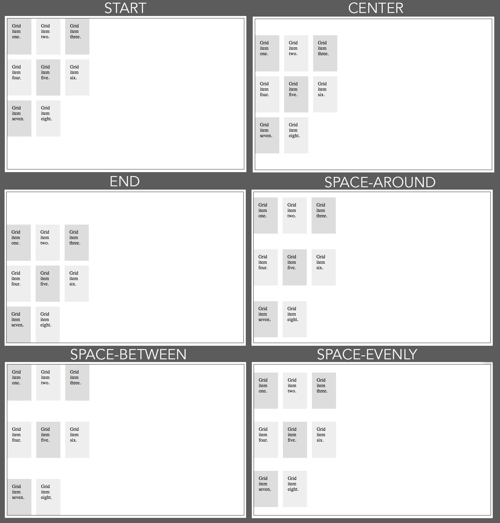
Justify and Align
Getting Started
Starting CSS
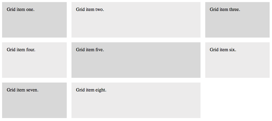
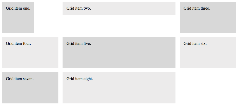
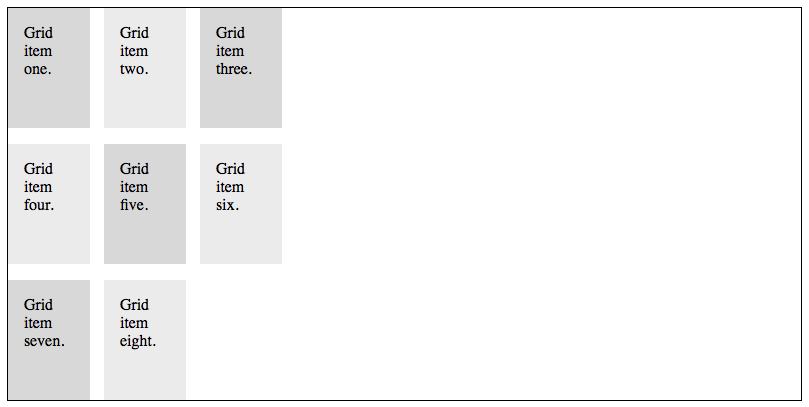
Add the CSS to the left. We are creating a grid container with three columns set up at 1fr 2fr 1fr.Starting HTML
Add the HTML to the left to create eight boxes (grid items) for our layout.Below is what you get in a browser. So far, we have not done anything with justification or alignment.